Comment
While history is never the same, we all know it rhymes, and since the start of this US equity bear market, we’ve been struck by the similarities to the dot.com bubble (“MI2 Chart Point: It’s Not Yet 2000 but…” 21st Feb 2022). In particular, we’ve noted how, after an initial period of rational outperformance driven by technological innovation, the trend fueled by central bank largesse developed its own reflexive momentum and price-induced supportive narrative. The result was a decade where there was no alternative to US stocks (especially technology), and the virtual vortex sucked in money from the rest of the world to fund this period of “US Exceptionalism”.

Unfortunately, the good times couldn’t last, and cracks have emerged as central banks have removed policy accommodation. This pain isn’t unique to the US. However, there is no question that with the dominance of tech in the major indexes, the US is especially vulnerable. Add in the need to finance energy projects and defence spending, especially in Europe, and it’s easy to see that going forward, foreigners might want to redirect their investment flows to the relative safety of their domestic markets. As we will outline below, the result is that the decade-long outperformance of the US vs its peers appears to be breaking down.
Charts
Before jumping into the relative charts, we want to flag a few US-specific trends because they might help to identify whether this correction will be “nice or nasty”. As we have previously discussed, a “nice” correction in this instance would require a bull market in which overseas stocks outperform on an absolute and relative basis. Typically, these are triggered by significant policy easing, which initiates extended declines in the dollar, such as the one we saw from 2002-2008. As we flagged in December, we wouldn’t rule out such a move (“MI2 Chart Point: Gold and Silver as a Hedge” 14th Dec). However, for now, we’ve suggested long silver vs US stocks precisely because we believe we remain in the “nasty” or bear phase of the move. To underline that point, below is the S&P Growth vs Value ratio chart, which we flagged in last month’s Virtual Roadshow. At the time, we suggested that with the oversold RSI, the chart looked just like it did at the end of 2000 (yellow circle), i.e., a pause was likely before the down move resumed in the new year, and that remains our base case.

Another chart from our Virtual Roadshow supports that idea, the logged version of the Nasdaq 100. In the last couple of weeks, we have tested the bottom of the outer channel, but each time managed to close above support, which currently comes in at 10,850. We aren’t suggesting selling here, but if this trendline breaks, we’d imagine the move will be “nasty”.

Fortunately, if you focus on the relative charts, you don’t have to decide the nature of the move. You just have to be underweight or short US stocks vs the rest of the world. The first relative chart we want to highlight is another from the Virtual Roadshow. At the time, we suggested that it represents the portfolio of a European fund that, for the last decade, had surfed the trend of a strong dollar and US stocks. Well, since last month, it has clearly broken.

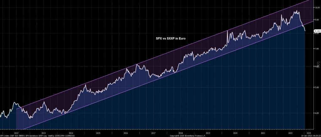
Focusing on tradable indexes, the same pattern is visible in the S&P vs the SXXP in Euro terms.
Within Europe, if you look back at our first chart, you will see that from the 2009 lows, the IBEX has been the worst-performing major market with barely a 14% return in dollar terms. Yet when charted against the best-performing market (Nasdaq 100), the IBEX has now broken a massive trendline and neckline on a head and shoulders top.

One possible explanation for the IBEX’s recent outperformance is that it is bank heavy. Courtesy of the end of ZIRP and the ECB hikes, European banks have materially started to outperform their US peers.

The other advantage the IBEX might benefit from is its exposure to Latin America. Note how broad EM (EEM) is also breaking up vs the Nasdaq, although obviously, Greater China is the key in that case.

Finally, on the subject of stocks, while there’s no question that Europe has taken the lead, the rest of DM might not be far behind. Indeed, charting the MSCI US Index vs the MSCI Rest of the World ex US Index (22 developed markets) shows how the US is now breaking a channel that goes back to 2009!

Bottom line, after yet another period of US Exceptionalism, the receding tide of central bank liquidity leaves US stocks uniquely vulnerable. Despite this, thus far, the US has largely held its own vs the rest of the world. However, if the charts are correct, those dynamics are beginning to change, suggesting we could be on the cusp of what is likely to be a sustained period of US underperformance with Europe, at least for now, the biggest beneficiary.
The big question remains: How quick will fund managers be to spot these trends? Will they be slow, the proverbial frog in boiling water, facilitating a benign or “nice” correction? Alternatively, will they jump aggressively, triggering a rapid “nasty” or bearish correction in US stocks and the dollar? While that remains our bias, for now, the major advantage of the relative trades is that we don’t have to make that decision just yet. Instead, we are looking to initiate positions into early year US strength, which hopefully retests channel or trendlines breaks.